
A weekly meme hosted by The Broke and the Bookish
I know, I know, most people hate redesigns. I do too for the most part. But you know, sometimes the original covers aren't great. Maybe they're boring, maybe they look like everything else out there, or maybe the new cover or paperback cover I just like better. So here is a list of book covers with redesigns I actually liked better.
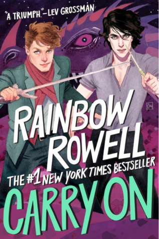 1.) Carry On by Rainbow Rowell - My Review
This paperback cover is just so freaking beautiful. Can we talk about how amazing Simon and Baz look? I mean come on! Look at Simon's scarf, and his hair, and his his sword. And look at Baz with his shirt slightly unbuttoned. I seriously cannot deal.
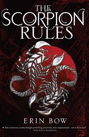 2.) The Scorpion Rules by Erin Bow - My Review
The original cover for this book was fine but it was a little complex with the chair made out of scorpions. The new cover is so much better though. Plus I like that the background looks like a mainframe or like something technilogical.
 3.) Mistborn by Brandon Sanderson - My Review
The original cover for this series was just not great. It was like an old school 90's kind of fantasy. The newer covers are better. And despite the fact that I don't like how young Vin looks in the YA crossovers (especially in The Hero of Ages) those are my favorite.
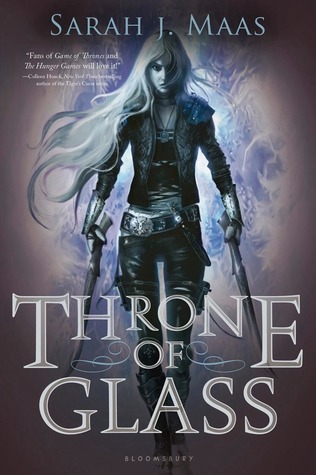 4.) Throne of Glass by Sarah J. Maas - My Review
Have you seen the original hardcover for this series? It's just a random blond girl on it, that's nothing special. And yeah, sure, the more graphic representation of Celaena isn't much better but it is definitely better. Plus she looks way more badass.
 5.) And the Trees Crept In by Dawn Kurtagich - My Review
With this book I'm really referring to the UK vs. US cover. I very much prefer the US cover for this book. The like gross slimy black stuff dripping off the girl's face in the UK cover is definitely creepy but like too creepy.
 6.) Salt and Storm by Kendall Kupler - My Review
I don't dislike the original cover for this book but I like the redesign better. The original is a little boring and doesn't tell you much about what it is about. This one shows you it's historical at least. Plus I am weird and like girl in a dress designs.
 7.) Dangerous Girls by Abigail Haas - My Review
The hardcover design works with the content, I mean it is about someone being murdered on the beach and their best friend being accused of that murder but I don't think the handcuffs on the beach design is as compelling. I'm more likely to pick this one up.
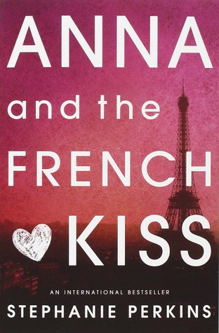 8.) Anna and the French Kiss by Stephanie Perkins - My Review
We are all agreed about this redesign, right? The pink cover with the city of Paris in the background is the better cover. I mean I assume we are all agreed because when Isla came out they offered covers to replace Anna for people.
 9.) Code Name Verity by Elizabeth Wein - My Review
I prefer the paperback for this one even though the original is really good. They both show memorable moments in the book but the paperback is more or a positive moment. Plus I like that there are planes in the background.
 10.) The Scorpio Races by Maggie Steifvater - My Review
I very much prefer the paperback cover for this series. The horse on the original cover is fine, it's nice and gets the point across, but these are demon water horses and the paperback definitely reflects that better. Plus there is just more movement and drama.
There you have it, the cover redesigns that I like better than their original designs. WHat redesigns do you like better? What books still need redesigns. Leave me a comment with your thoughts. Thanks for stopping by and HAPPY READING!
I like the look of the paperback of Code Name Verity and The Scorpio Races too. None others are coming to mind at the moment. Link to my TTT
ReplyDeleteHi! I actually preferred the first Anna and the French Kiss cover. Sometimes I don't like change, though, so that might be it! :)
ReplyDeleteMy TTT
Leslie
OOoh nice topic choice. It's hard for me to say what redesigns I actually like better than the original. I think for the most part, I've still be a fan of the original, but there's something rather stunning about the new ones too!
ReplyDeleteHere's my Tuesday Post
Have a GREAT day!
Old Follower :)
Definitely agree with you on the Mistborn covers. The news ones are much, much better. A friend recommended the series to me or I never would have picked them up, especially with the old covers.
ReplyDeleteHappy TTT!
I love the updated cover for Anna and the French Kiss, but I prefer the original cover for Carry On (I know I'm in the minority there).
ReplyDeleteI love that redesign of Carry On! :)
ReplyDeleteLauren @ Always Me