
It was extremely hard for me to pick ten different books that I have read or want to read with covers I wish I could redesign for the simple reason that I judge a book by it's cover. I know, I know, you're not supposed to do that but it works. Very rarely have I seen a book with a cover I loved and the actual book was awful (I'm looking at you A Discovery of Witches). Mostly I just won't pick it up. If I'm walking through a book store or browsing online I will be drawn to a book with an interesting cover and I'll check it out. Let that be a lesson to you book publishers... Make your covers eye-catching.
So here it is my very hard fought list of ten, in no particular order.
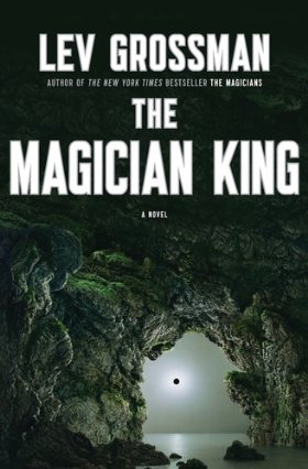
 1.) The Magician King by Lev Grossman - I loved the cover of The Magicians with a simple and ominous tree design. This cover is equally ominous but too complicated.
2.) Sarah's Key by Tatiana De Rosnay - A beautiful cover and very eye catching but it's always bothered me that there is no key... Where is the key? It's in the title! It's important to the story!

 3.) Bridget Jones's Diary by Helen Fielding - This cover is just weird and creppy and makes me not want to keep a journal!
4.) Sisterhood Everlasting - I own (and love) the entire Sisterhood of the Traveling Pants series and yes, they could probably use an update (their very early 2000s) which they got, but I am forever bothered by the fact that it doesn't match my collection.

 5.) Rebel Angels by Libba Bray - The other two books in
the Gemma Doyle Trilogy have sweet corset designs and this one doesn't
also even the title for this seems unrelated to the other two books.
5.) Rebel Angels by Libba Bray - The other two books in
the Gemma Doyle Trilogy have sweet corset designs and this one doesn't
also even the title for this seems unrelated to the other two books.6.) Harry Potter and the Sorcerer's Stone by J.K. Rowling - I generally love the Harry Potter cover designs. This one however has always bothered me because it is not a single scene in the book and the scene depicted is a very minor one. I do however love the unicorn.
 7.)
A Wrinkle in Time by Madeleine L'Engle - I adore this book and the
original design is better but this is the cover of the version I read
and this is the cover I see most often. It's weird, it's confusing, and I
hate that creature thing that Mrs. Whatsit turns into!
7.)
A Wrinkle in Time by Madeleine L'Engle - I adore this book and the
original design is better but this is the cover of the version I read
and this is the cover I see most often. It's weird, it's confusing, and I
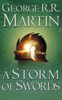
hate that creature thing that Mrs. Whatsit turns into!8.) A Storm of Swords by George R.R, Martin - this book is utterly insane. This is cover is completely dull! I've always been bothered by the fact that there's no sword. And I don't at all remember a helmet having any significance in the story at all.

9.) The Twilight Saga by Stephanie Meyer - Now don't get me wrong these covers are well designed they just have nothing to do with the story. What am I supposed to deduce by these covers? Breaking Dawn made a little bit of sense but if the other three were trying to be metaphors they failed!
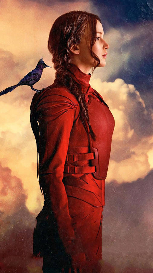
10.) The Hunger Games by Suzanne Collins - This last one was the most difficult. My feeling against these designs aren't very strong. I just find them a little boring. I dig the first one but by Mockingjay I was getting a little board with the bird motif. We get it, she's a symbol for freedom. Put the stick down. The horse is dead!
I agree with your choices. The Bridget Jones one is just hilarious it's so bad! I never liked The Hunger Games covers either. The Song of Ice and Fire series has completely boring covers for sure. Though I kind of liked the Twilight covers. Both for sentiment and because I just like the contrast of the black, white, and red colors. I agree that they mostly don't have anything to do with the stories though. The first one and last are arguable, but the middle two for sure are out of left field.
ReplyDeleteTTT
Sandy @ Somewhere Only We Know